Your Walls Already Have a Color Story
Every room tells a color story whether you've planned it or not — your paint, your furniture, your textiles are already in conversation with each other. When you bring in wall art, you're adding a new voice to that conversation, and the key is deciding whether you want it to harmonize or contrast. A piece that shares one or two hues with your existing palette will feel like it belongs, as though it was always meant to be there. On the other hand, a thoughtful contrasting color — think a warm terracotta print in a room full of cool greys — can create the kind of tension that makes a space feel intentionally designed rather than accidentally assembled.
Warm, Cool, and the Mood They Carry
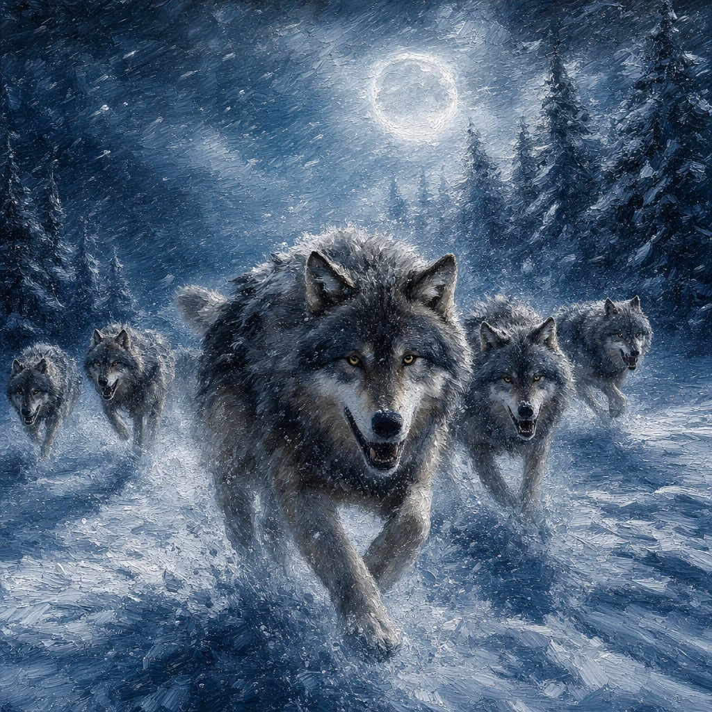
Color temperature is one of the most powerful and underrated tools in decorating, and it applies just as much to art as it does to paint chips. Warm tones — reds, oranges, golden yellows — tend to energize a room and draw the eye in, making them a natural fit for social spaces like living rooms or dining areas. Cool tones — soft blues, sage greens, muted purples — have a calming, expansive quality that works beautifully in bedrooms or reading nooks where you want to feel settled. When you're browsing for art, try to identify its dominant temperature first, before you even think about subject matter, because that temperature will set the emotional register of the entire wall.
Using Saturation to Anchor or Lift a Room
Beyond hue and temperature, saturation — how vivid or muted a color is — quietly controls whether your art feels grounded or airy. A highly saturated, bold print will anchor a wall and naturally become the focal point of a room, so it works best when the surrounding decor is relatively restrained. A desaturated or tonal piece, with its whisper of color rather than a shout, layers beautifully into rooms that already have a lot going on visually. DriftPrint lets you dial this in precisely, generating art in exactly the palette and mood your space is calling for — so you're never left hoping a print will somehow work once it arrives.
Find Art That Fits Your Color Palette Perfectly
Generate a free preview with any of 28 styles — no commitment until you love it.
Create Your Custom Print